David da Silva Contín

Green Project · Staff product designer

Designing a decarbonization marketplace from zero

How I led discovery, shaped product strategy, and shipped a marketplace that closed a partnership with an aviation company — while working solo across two continents.

  • Company Green Project
  • Role Sole designer
  • Scope Discovery → shipped product
  • Team UK + US cross-timezone
The v2 Marketplace page showing commodity cards for different decarbonization products
The Marketplace page — designed to scale to multiple commodity types from day one.

US team

Scott PM · corporate carbon accounting & marketplace
Shivani PO · marketplace
Chris PO · corporate carbon accounting
Will Co-founder & COO · domain expert
Adam Operations · marketplace
Luke Co-founder & CTO · domain expert
Jeff Tech lead
Austin, Jack, Jess, Kamira, Mario, Michael Software engineers
Aysu, Olga QA engineers

UK team

Ed PM · supplier engagement & product carbon footprinting
Ben Tech lead

Design team

David Staff product designer

ACT Group (parent company)

Jop VP of Digital

The problem

A v2 migration: a once-only window to get the foundations right — with a team I'd never worked with before

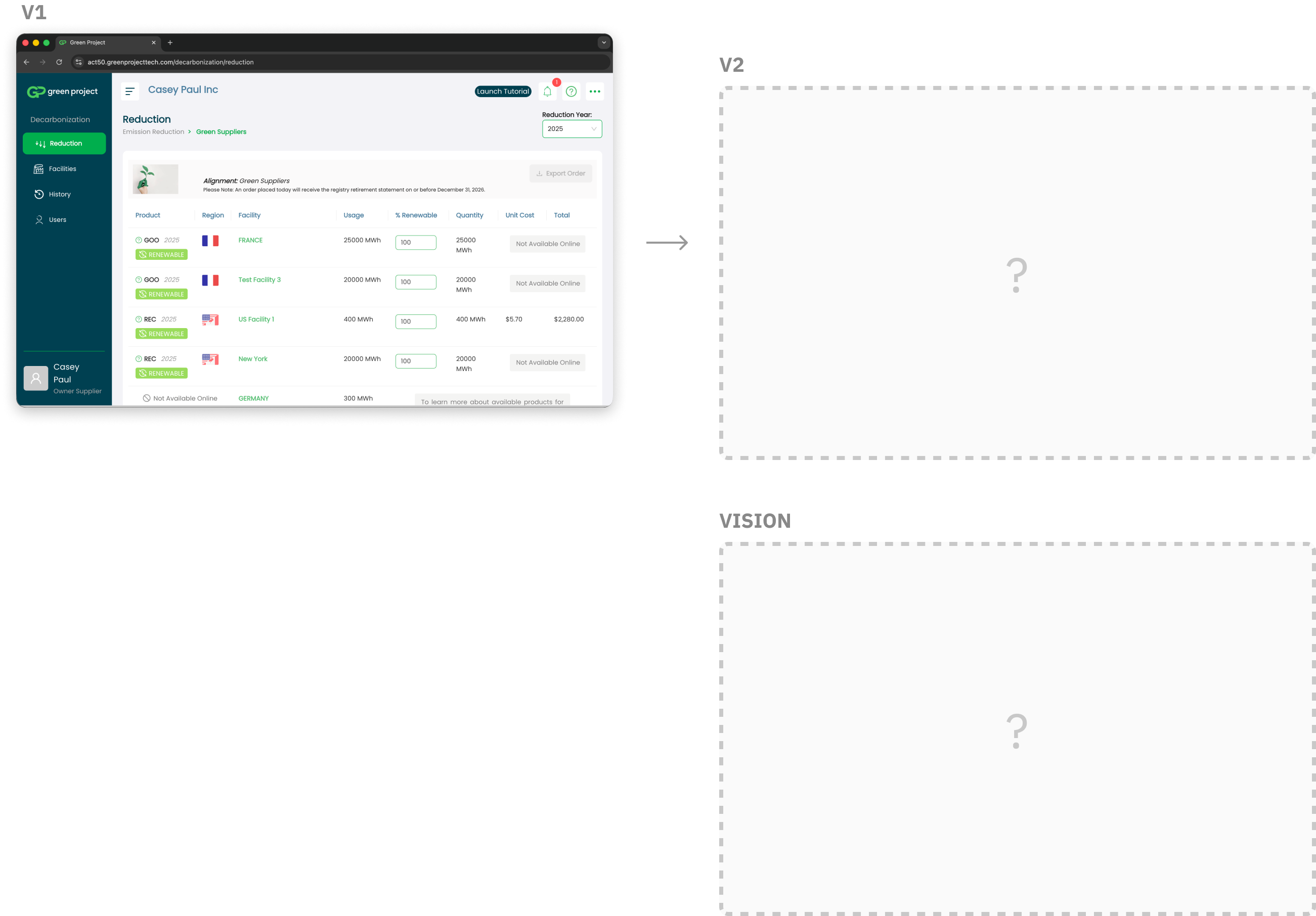
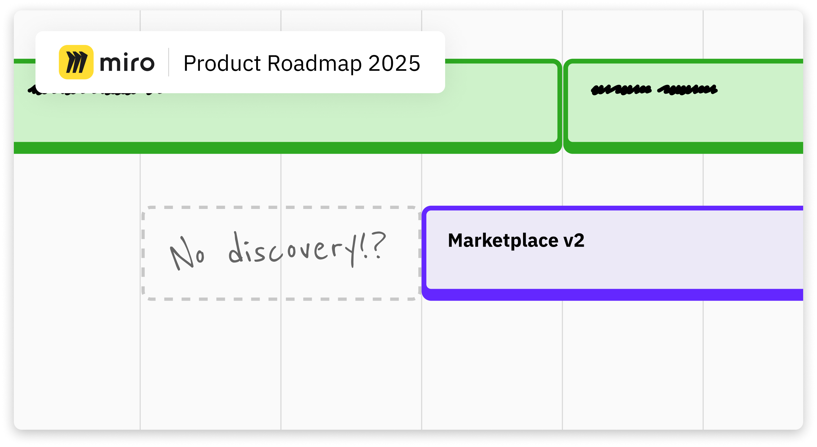
The US team was mid-migration from v1 to v2 of their products. They were finishing the migration of their carbon accounting product, and the marketplace one would be next. It was a natural moment to rethink the design — to build something with higher conversion, a more intuitive experience than v1, and a system that would stand the test of time.

But there was no discovery time allocated, no shared vision, and I was parachuting in to work with a US-based team for the first time.

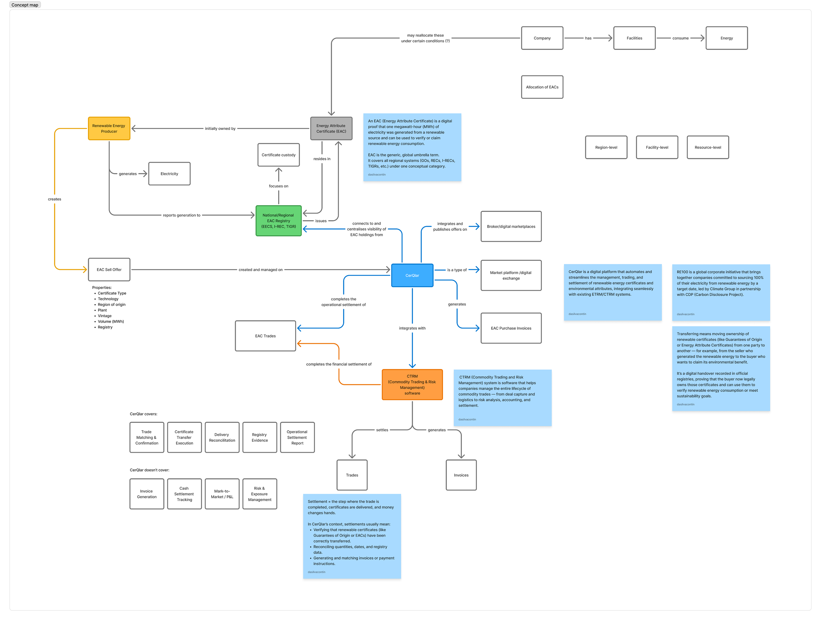
Adding to the complexity, the Marketplace serves four distinct personas — each with a different driver and different available data:

  • Sustainability Managers — already using our corporate carbon accounting product; already have electricity data in the platform
  • Suppliers — coming from our supply chain engagement product to fulfil customer requests; varied ages, varied tech adoption, no electricity data in the platform
  • ACT Referrals — coming from our trading arm, primarily to execute a transaction; we don't need their electricity data
  • Partner Users — arriving via third-party partners; we are not allowed to show or upsell other parts of the platform
V1 marketplace screenshot on the left (table-based UI), with V2 and Vision placeholders on the right showing the blank slate we were designing into
v1 (left) — a real screenshot of the existing product. v2 and Vision (right) — blank slates at the start of discovery.

Design leadership

I created the conditions for good design: I influenced starting discovery early and aligning on a long-term vision

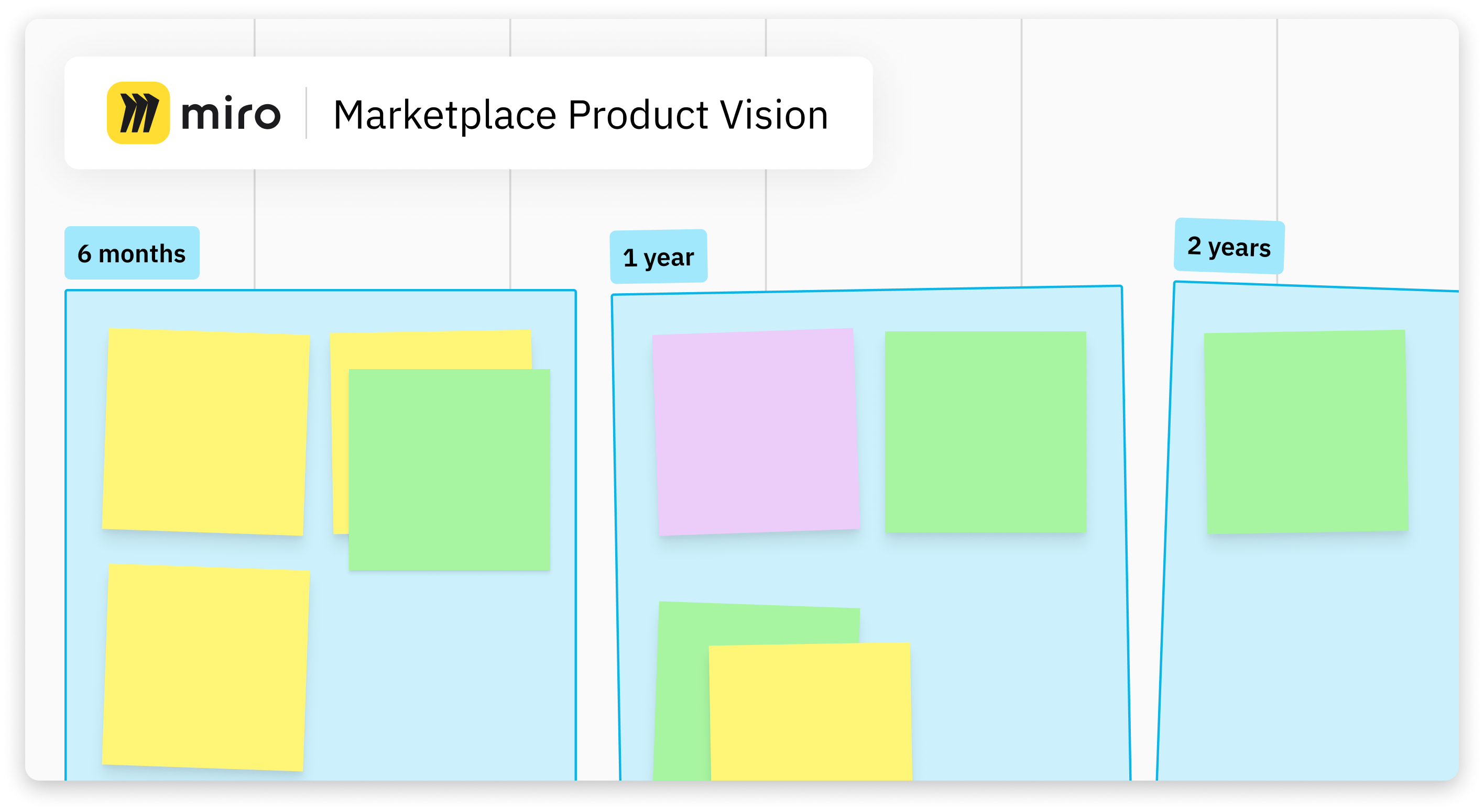
My approach to new product areas follows a consistent principle: think big, start small. Establish a shared vision first, then carve out the smallest meaningful slice to build from. In my experience, this yields systems that scale, patterns that get reused, and a north star that makes every subsequent decision easier to make.

I made the case in a company-wide leadership meeting: if we didn't start discovery early, we'd ship a lower-conversion product built on shaky foundations — and engineers would hit build kickoff with no specs, no direction, and a designer still iterating to catch up. The real cost was building twice. Leadership agreed. I then pushed for a long-term vision workshop, which the marketplace PM ran.

Product roadmap in Miro showing the Marketplace v2 initiative, with a dashed
The product roadmap as it stood. "No discovery!?" — the gap I flagged in the leadership meeting.
Marketplace Product Vision board in Miro with post-its grouped under 6 months, 1 year, and 2 years timeframes
Vision workshop output — the long-term direction translated into a structured Miro board.

Systems thinking

I mapped an entirely new domain before touching a design tool

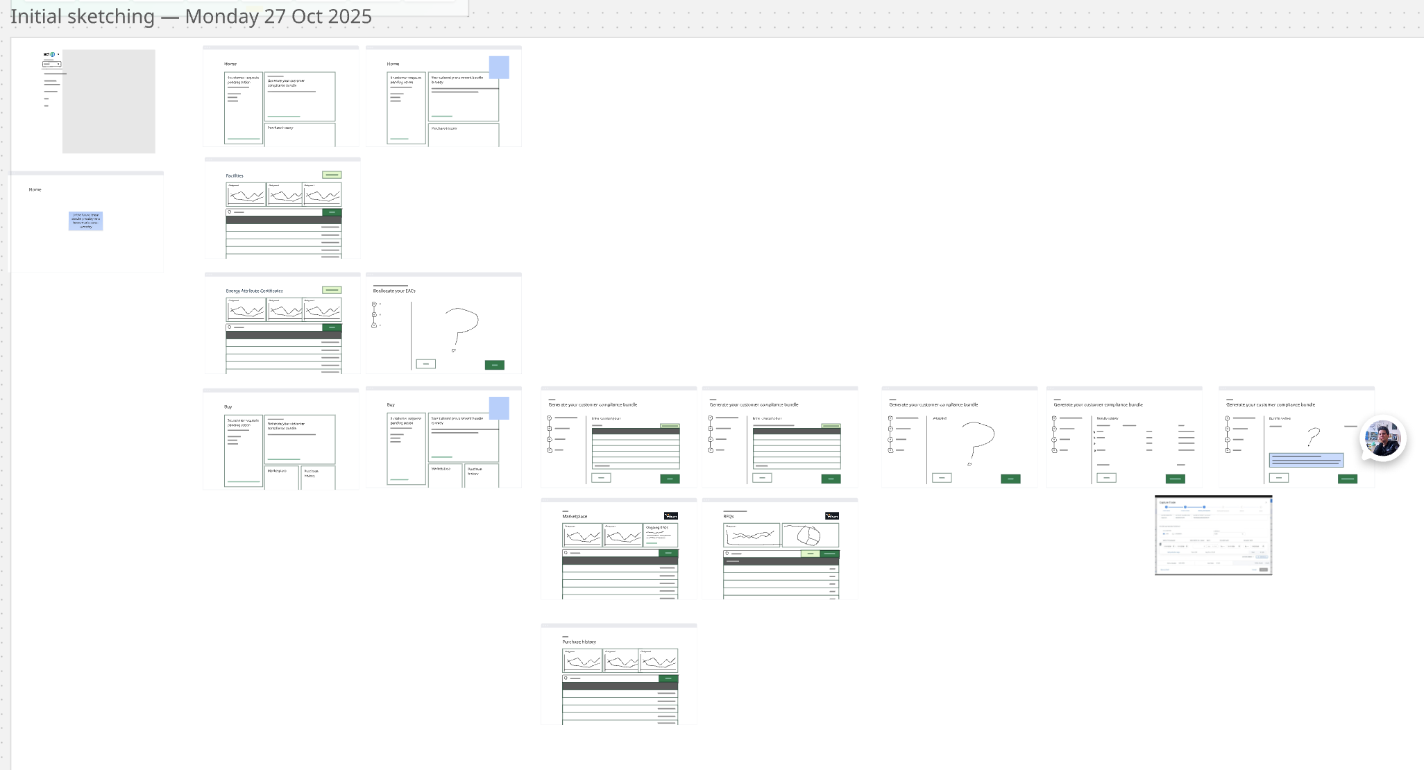
Renewable energy certificates were completely new to me. Before any wireframe, I independently mapped the domain — objects, attributes, relationships, and calls-to-action — learning what I could without using a colleague's time.

Domain model mapping the objects, attributes, relationships, and calls-to-action for renewable energy certificates (RECs)
Domain model from Miro — the system map of RECs before any design began.

Risk-led discovery

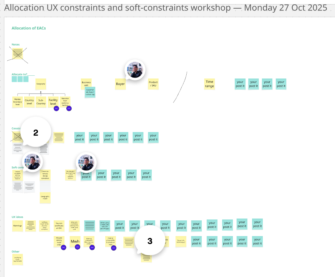
I sorted every unknown by blast radius and drove discovery accordingly

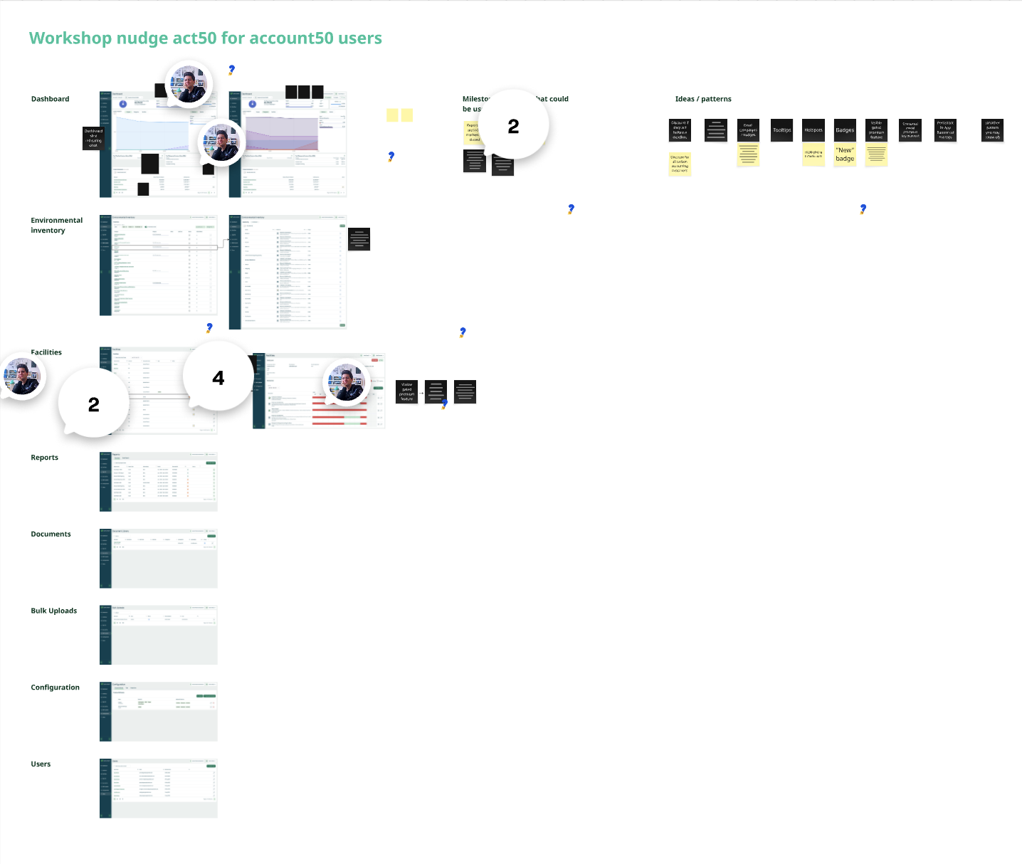
I captured every open question on a Miro board and ranked them by how much rework a wrong answer would cause. The most foundational unknowns — the ones that would force a redesign if answered late — I resolved first. I used this to structure recurring sessions with the PM and PO, called out missing jobs-to-be-done in the PRD, created the out-of-scope section, and pushed for alignment on what slice 1 would and wouldn't include.

Miro board with columns of post-its representing open questions sorted by blast radius, each tagged with a status: To do, In progress, Done, or Delete
Open questions board — every unknown captured, ranked by rework cost, and systematically resolved.

Cross-timezone collaboration

I kept two continents aligned, autonomously

Working from the UK with a US team meant a narrow daily overlap window. In week one, I booked daily reserved time blocks — not meetings, just protected space for questions or workshops whenever I needed them. I published weekly Slack updates so anyone could stay across the design direction without a meeting. The PM never had to chase me.

Google Calendar week view showing daily holds blocking time across the whole week for design sync
Week 1 — a daily hold across the whole week, keeping overlap time protected for the US team.
Slack message showing a weekly design update with sections for this week, next week, and decisions needed
Weekly Slack update — self-initiated, every week, without being asked.

Vision & Direction

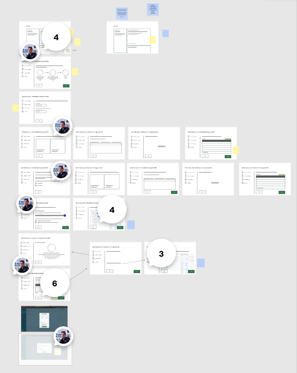
I diverged, prototyped, and aligned stakeholders on a long-term and short-term UX direction

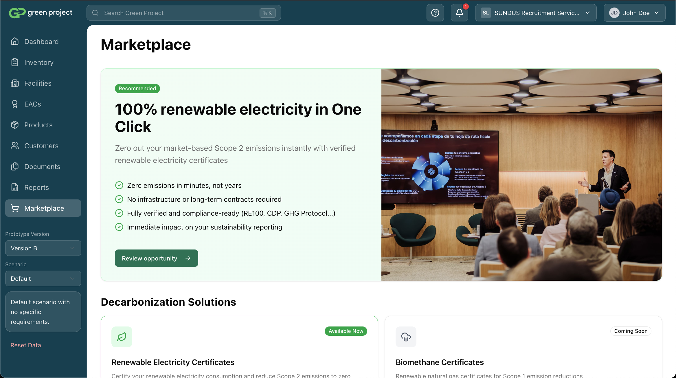
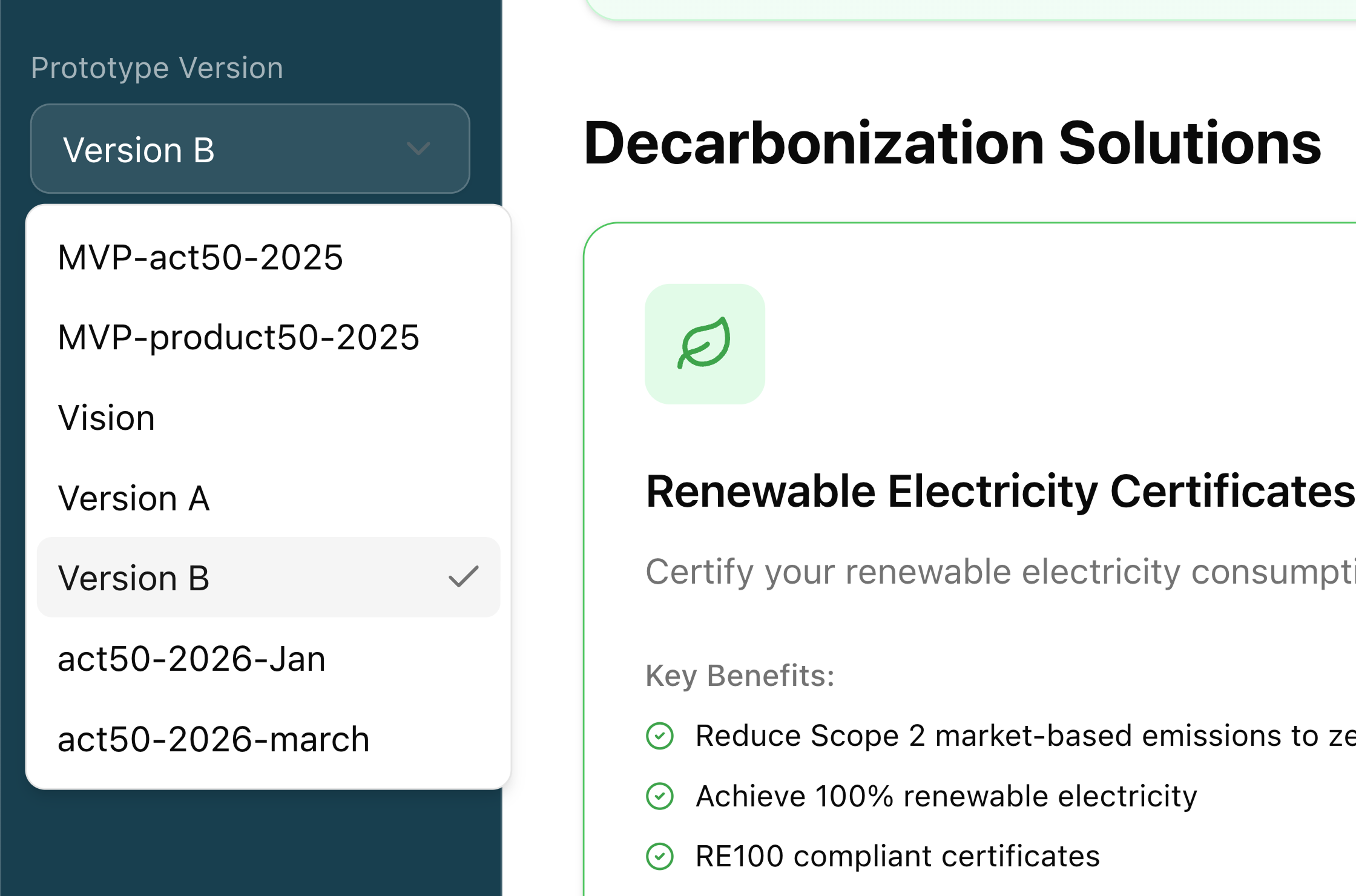
I translated the workshop output into a UX vision in Miro, aligned stakeholders on it, then built a live-coded prototype to bring it to life. The prototype included a version dropdown — letting anyone switch between the full long-term vision and the scope for each slice. One artifact that held both the ambition and the plan, and made the distinction between them impossible to misread.

Rather than jumping to solutions, I explored divergent directions and pressure-tested them with the team. The result was a shared UX direction covering both what we'd ship in slice 1 and how the product would evolve — including a Marketplace page I proposed, anticipating future commodities. The co-founder pushed for it to be included in slice 1 for its sales and partnership value.

Work in progress screen 1 — early design exploration for the marketplace
Work in progress screen 2 — early design exploration for the marketplace
Work in progress screen 3 — early design exploration for the marketplace
Work in progress screen 4 — early design exploration for the marketplace
Work in progress screen 5 — early design exploration for the marketplace
The live-coded prototype showing the version selector dropdown open, with options for Vision (Full), Slice 1, and Slice 2
The version dropdown — one prototype artifact holding both the long-term vision and the near-term scope.
Review your order screen from the v2 marketplace prototype
Review your order — one of the key screens in the purchase flow.
Purchase complete — the celebration moment at the end of the flow.

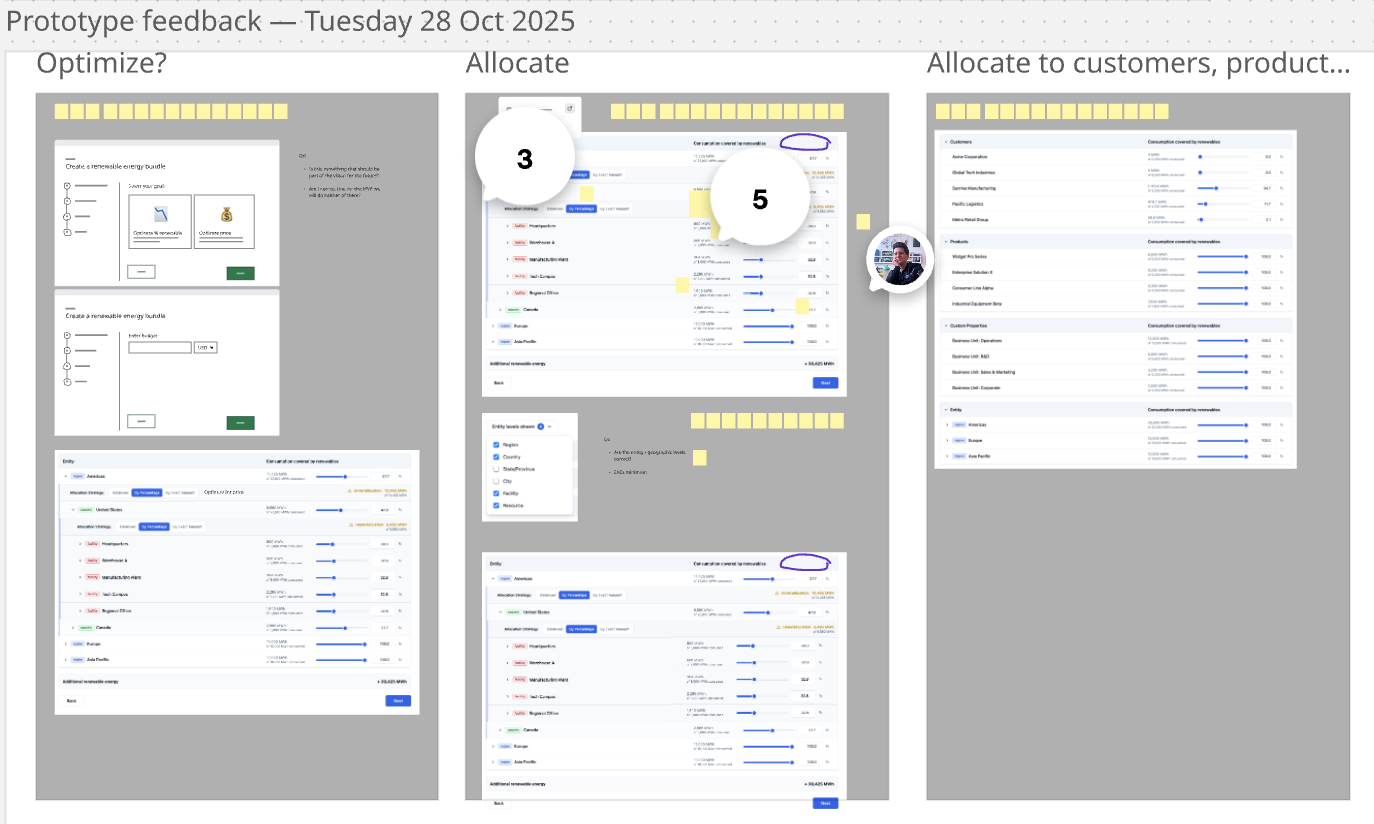
De-risking the hardest decision

I identified the highest-risk UX area and resolved it through structured user testing

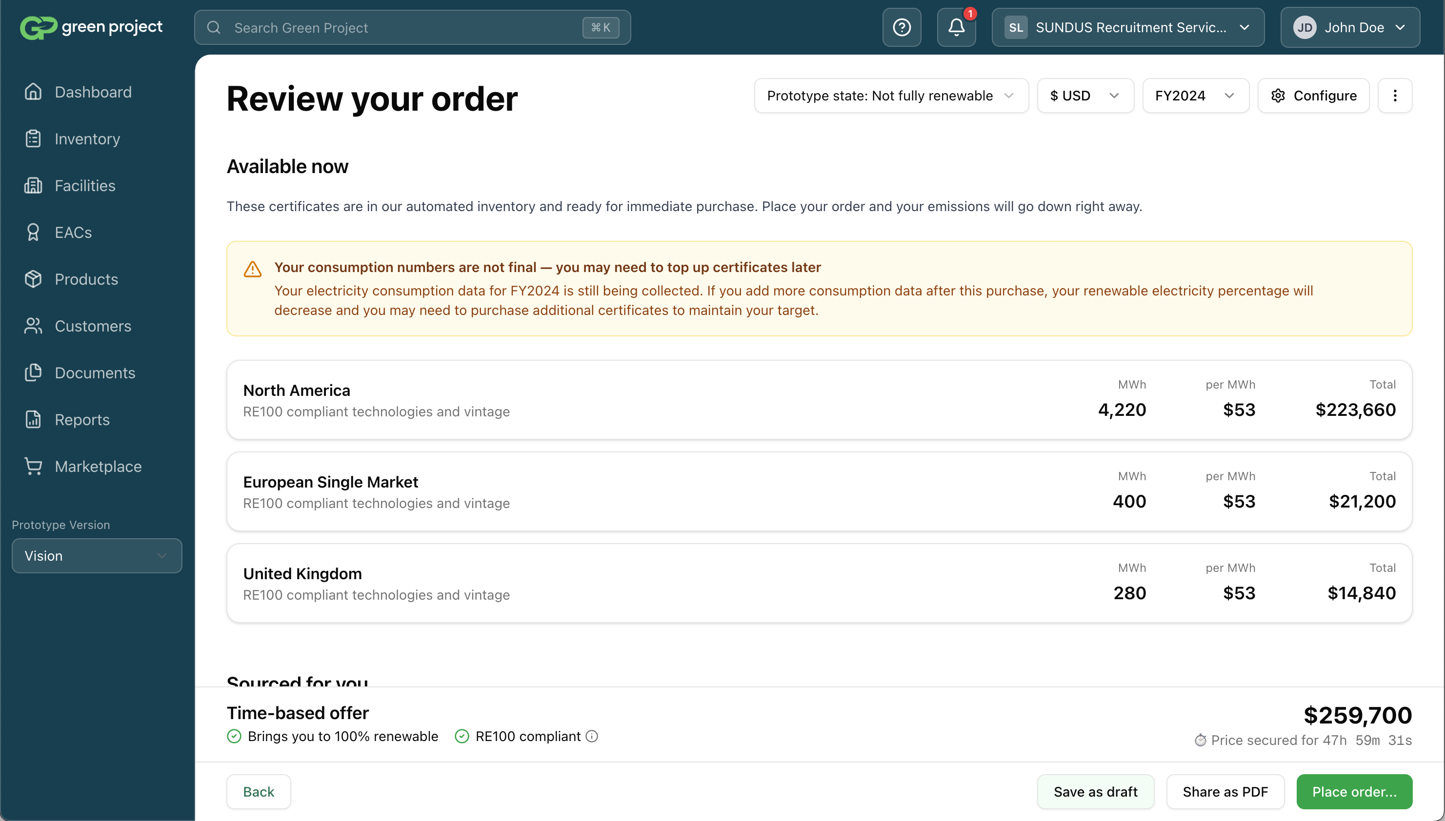
The bundle configuration controls were the highest-risk interaction in the design. I designed a few competing directions, prototyped them, and ran a user test with task-based scenarios. Direct manipulation won: more intuitive, more visual, giving users immediate transparency over what their choices would produce.

Bundle configuration — directions
Variant A — Direct manipulation Winner
Volume (MWh)
Vintage year
Energy source
Variant B — Rules-based
Volume (MWh)
Enter amount
Vintage year
Select year
Energy source
Select type

Real image: a side-by-side of the two competing bundle configuration directions — Variant A (direct manipulation: sliders, draggable zones, visual controls that give immediate feedback on what the bundle will look like) and Variant B (rules-based: a form with dropdowns and inputs). Both should come from the actual prototype, at the same screen/state. Label them clearly as Variant A and Variant B. Mark the winner (Variant A) with a visual indicator. The contrast should make immediately clear why one won: Variant A shows you the result as you configure; Variant B makes you imagine it.

User test plan
Bundle Configuration — User Test
1
"You need to offset your company's 2023 electricity. Configure a bundle for 500 MWh from wind sources."
2
"Adjust the bundle to split equally between wind and solar, keeping the same vintage year."
3
"Change the delivery year to 2024 and confirm the updated price estimate."
5 participants · Mix of Sustainability Manager + Supplier personas · Think-aloud protocol

Real image: a screenshot of the actual user test plan document — either from Notion, a Google Doc, or wherever it was written. Key elements to show: the task scenarios (written as realistic user goals, not feature instructions), the participant criteria (how many, what personas), and the testing protocol (think-aloud, task completion, etc.). This is evidence that the decision wasn't made by gut — it was validated with real users against realistic scenarios.

Handoff

I handed over a prototype, not a Figma file — a first for the US team, and the right call

The US design system was in poor shape — not built by a designer, and with an uncertain future. I made the case to the PM and tech lead to skip Figma entirely and hand over the coded prototype directly, with state dropdowns to explore UI variations. Engineers used their judgment on components; I did a light feedback pass. The bet paid off — the US design system is now being replaced with IBM Carbon.

😒
nah
Figma file handoff
Components, specs, redlines...
😍
yes
Coded prototype handoff
Live in browser, state dropdowns, zero Figma

Real image: a Drake-style reaction meme (the "Hotline Bling" format — two panels, top panel Drake waving away something, bottom panel Drake pointing approvingly). Top panel: "Figma file handoff" (redrawn/text overlay). Bottom panel: "Coded prototype with state dropdowns" (redrawn/text overlay). The meme tone is intentional — it's honest about the unconventional choice and signals design confidence. Could be made with a real Drake image or as an illustrated/typographic version to keep it clean for a portfolio context.

#marketplace-feedback
J
Jeff
For the filter component on the bundle config — should it use the existing pill component or are we building new?
Reply
D
David
Good catch — use the existing pill. The new interaction is in the slider, not the filter UI.
A
Austin
Date input on the vintage year selector — should this accept free text or only calendar picker?
Reply
D
David
Year-only dropdown — no free text. Values are constrained to available inventory years.

Real image: a screenshot of the actual Slack (or GitHub / Linear / Notion) feedback thread where engineers asked clarification questions after receiving the prototype. The thread should show the back-and-forth: an engineer raises a component or behaviour question, David answers quickly and precisely. This demonstrates that the prototype handoff worked — questions were specific and implementable, not "wait, what are we even building?" The light feedback pass was a real thing; this is the evidence.

Outcomes

Higher conversion, an aviation partnership, and a US team that now trusts me to lead

Aviation partnership

Closed using the Marketplace as a sales and partnership tool

Scales to new commodities

Architecture designed for future expansion beyond RECs

More intuitive than v1

The experience is on rails with low cognitive load.

Self-running

PM follows the design direction without needing ongoing input

Cross-team trust earned

US team went from strangers to full confidence in design leadership

Order confirmed · v2
My Bundles Order #████
REC Bundle — 2023 Vintage
✓  Purchase complete
Partner ████████████
Volume ████ MWh
Energy source ████████
Total $██,███
Status Complete

Real image: a screenshot of an actual completed purchase in the v2 Marketplace — ideally the aviation partnership order or one of the first real transactions processed through the new system. Blur or redact any commercially sensitive details (partner name, volume, total price) but keep the structural UI visible — the order header, the "Purchase complete" status badge, the row layout. The point is not the data; it's that the system was used to close a real deal. A real screenshot with blurred numbers is more powerful than a clean mockup.